
A calm, detailed statistical data comparison slide log
Explore the historical dates, country maps, and portrait scores of famous figures.


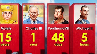
Data visualization channel World Data 3D presents a five-minute statistical slide video comparing historic public figures. The video displays digital bar charts, country maps, and simple portrait cards in a clean digital workspace. The pacing is steady, with screen boards showing names, years, and data categories in a silent, low-sensory layout. Spoken with zero dialogue, it provides a safe history and statistics support watch for older primary children.
At a glance
Will it actually calm them down?
 Eases a wound-up mood back to settled.
 A gentle lift on a flat, low-energy afternoon.
 Steady enough for meltdown recovery.
Scores measure how reliably this video moves a child toward a settled, regulated state. In the Piko app, kids tell us their weather and we do the matching automatically.
Which kids will love it?
Why it works
The data comparison layout turns historical figures into a structured lesson on graph coordinates, chronological sorting, and record tracking. By showing how data categories align along country codes and centuries, the video builds math logic and database research. It functions as an engaging, short study helper watch to settle busy minds on calm afternoons.
When to reach for it
- Rainy afternoon rescue An absorbing, quiet data chart to settle busy minds on wet days.
- School history support Great educational background for kids studying chronological timelines and databases.
- Quick research break A quiet, research-focused watch to settle busy minds between study blocks.
Sensory & SEN notes
If they love this, try these

Questions parents ask
Does this comparison video show inappropriate content?
No, it features standard historical museum portraits with zero inappropriate details.
Are there sudden loud sounds or alarms?
It utilizes a calm, low background synth hum with zero loud audio peaks.
What age group is this data video for?
The lack of narrative and focus on raw data statistics is best for kids aged ten to eleven.
40+ checks per video, with a final pass from the review desk · Scored 20 July 2026 · We do not host videos; playback is via YouTube's official embed.